Freshartcreations India

Technology is always changing and conversion of a website into responsive design is the latest trend. We have well experienced team of designers, who love to give responsive look to your website.
A theme of making a responsive website is designed to view a site on any screen and stretch or minimise accordingly to fit any kind of device and make a website accessible on handheld devices and compatible with mobile web browsers. Our developers assure the clients by spending quality time with them to understand their needs and provide a customized solution to them.
Our designers kick the technology from WEB to MOBILE by offering original design, smart ideas, creativity within minimum requested time frame of every project. At FRESHARTCREATIONS, our team of designers are highly skilled, trained and specialized in tackling any kind of problem related to websites in the best possible way. We have passion to turn your dream into reality.
HTML5 allows mobile web designers to design more dynamic and engaging web content for different use cases and user experiences. Optimizing HTML5 features for mobile interfaces, enables brands to keep pages light and focus on functionality that takes advantage of the smaller screen size of mobile devices.
By implementing a well-executed mobile strategy that takes advantage of next-generation HTML5 technology, consumer-facing brands will see an increase in conversion, repeat visits, and overall positive brand awareness from users engaging with their brand via mobile devices.

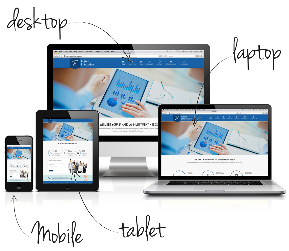
From a user perspective, a site built using responsive design offers a high quality experience. Sites not optimized for mobile devices often display content that is difficult to navigate or too small to read.
From the point of view of the site owner, a site that uses responsive design only needs to be built once - you don't need to build a web version, a mobile version and a tablet version separately - so this usually saves time and money, Plus any updates that then need to be made only have to be implemented on one site.